
Pipeline Flow Visual
Identify potential bottlenecks in a process.
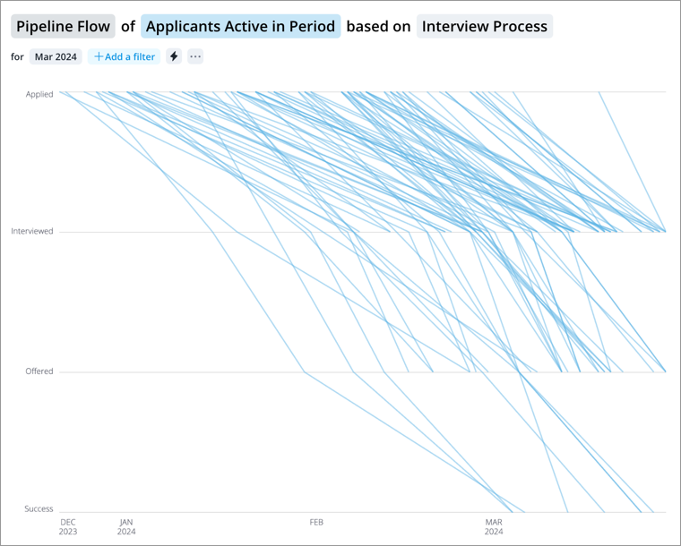
The Pipeline Flow visual shows the path of each applicant as they go through the hiring process. You can use this chart to see how applicants are progressing through your pipeline and identify any bottlenecks within the hiring process.
This visual can also be accessed from the Pipeline Funnel visual:
- Select Pipeline Funnel in the Visual picker.
- In the Insights tab of the Info panel, click View flow analysis under the Try next section.
How to explore the paths to gain insight
- Click a path to see details about a specific applicant including how long they have been in their current stage and their total time in the pipeline.
- Click a suggested view to highlight successful and failed outcomes as defined by your organization. For example, the fail category can include rejected applicants and applicants who have abandoned their applications. Apply additional filters to see a specific outcome (for example, rejected applicants).
- Adjust the time period to focus your analysis on a specific period.
- Add a filter to focus your analysis on a specific population. For example, add a filter for key roles or leadership positions to see whether or not these important positions were filled in a timely matter.
How applicant paths are displayed in the chart
The chart displays a path for applicants once they have moved past the first stage of the hiring process. Applicants who have abandoned their application in the first stage, applicants who have been rejected in the first stage, and applicants who are in the first stage during the selected time period are not visually represented because they have not moved to another stage. However, you can still search for these applicants and they will appear as dots in the chart.
How chart completeness works
If your analysis population has more than 250 applicants, the chart will display a representative sample of your analysis population. Applicants who have not moved past the first stage of the hiring process are not included in the sample calculation, and they will not be visually represented. To see all applicant paths, we recommend that you filter your analysis population to be less than 250 applicants.
What happens when you select a time range for analysis
When you adjust the time period, you may not see the applicant’s entire path. Consider Hailee Roger's journey through the applicant pipeline:
- February 11 2016 - Applied
- February 15 2016 - Screened
- February 18 2016 - Qualified
- February 22 2016 - Interviews Started
- February 27 2016 - Interviews Completed
- March 04 2016 - Selected
- March 07 2016 - Offered
If we select a time period of February 2016, the chart will show Hailee’s movement from February 11 2016 to February 29 2016. Although Hailee is currently in the Offered stage, you will see Hailee’s path end at the Interviews Completed stage because that is the stage she is in at the end of the selected time period.
The chart shows the movement of each applicant from when they entered the pipeline up to the end of the selected time period. Let’s say Hailee applied in December instead of February, you will see her path trace back to December when she first entered the pipeline.